Rebecca Hay Designs | Behind the Design : Powder Room
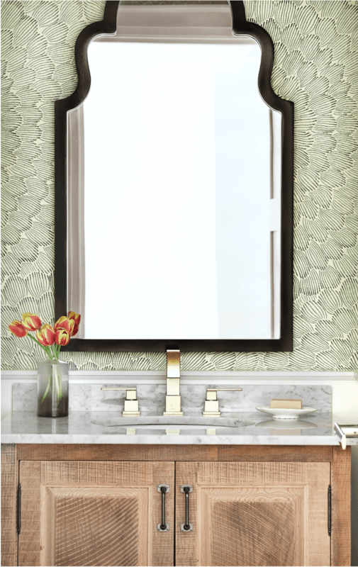)
When our clients first approached us to renovate their Powder Room, it was quite obvious that their existing space was in dire need of a makeover. The space was tired-looking, lacked personality & the layout did not work.
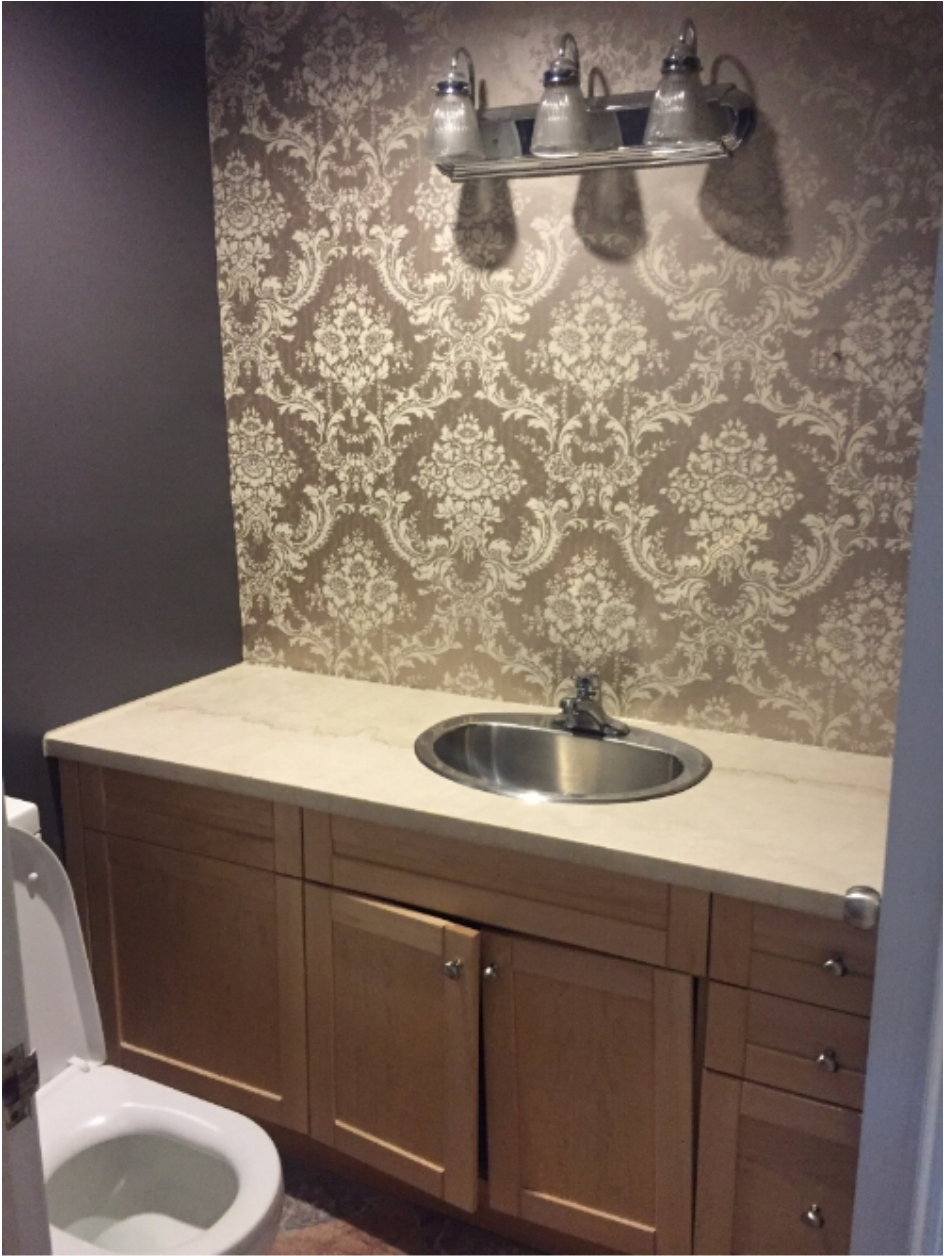
BEFORE: This small main floor powder room was outdated with an oversized vanity which took up the entire back wall. The toilet was in the wrong location and too close to the wall and the wallpaper, lighting & flooring were dated and needed a modern refresh.
The client wanted the space to to be a pretty jewel that flowed with the sophisticated country vibe throughout the rest of their house.
I always want a powder room to make a statement. It's usually one of the smaller rooms in a home and so any amount of pattern or colour can be used without overwhelming. I love to use wallpaper for that reason. It adds a fun sophisticated vibe and turns an ordinary room into a little jewel box.
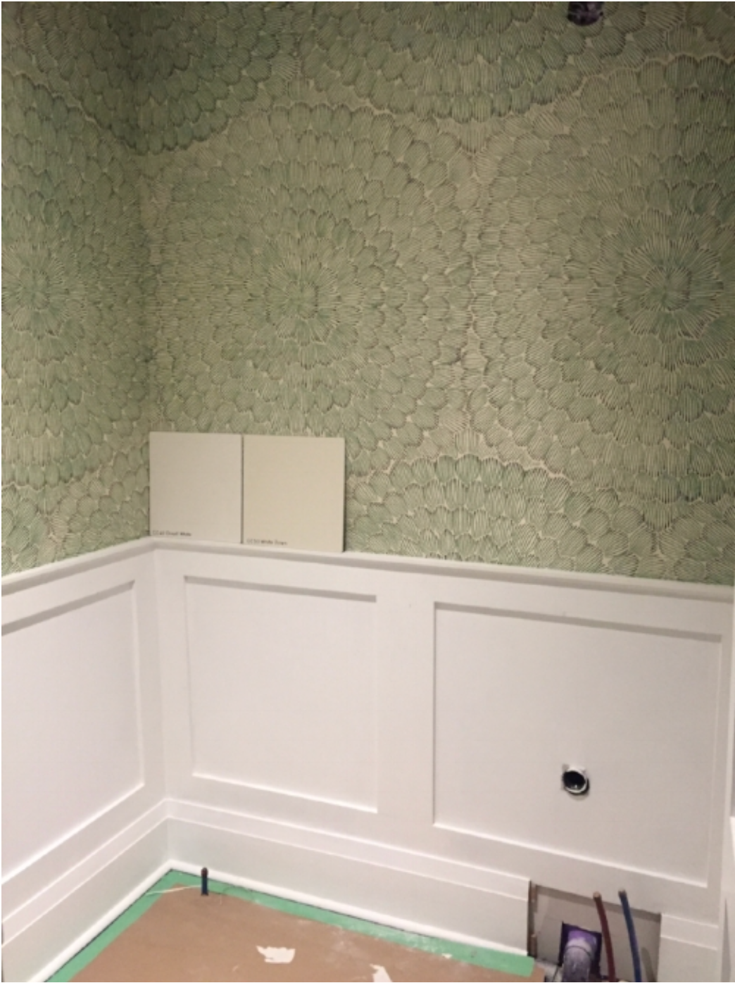
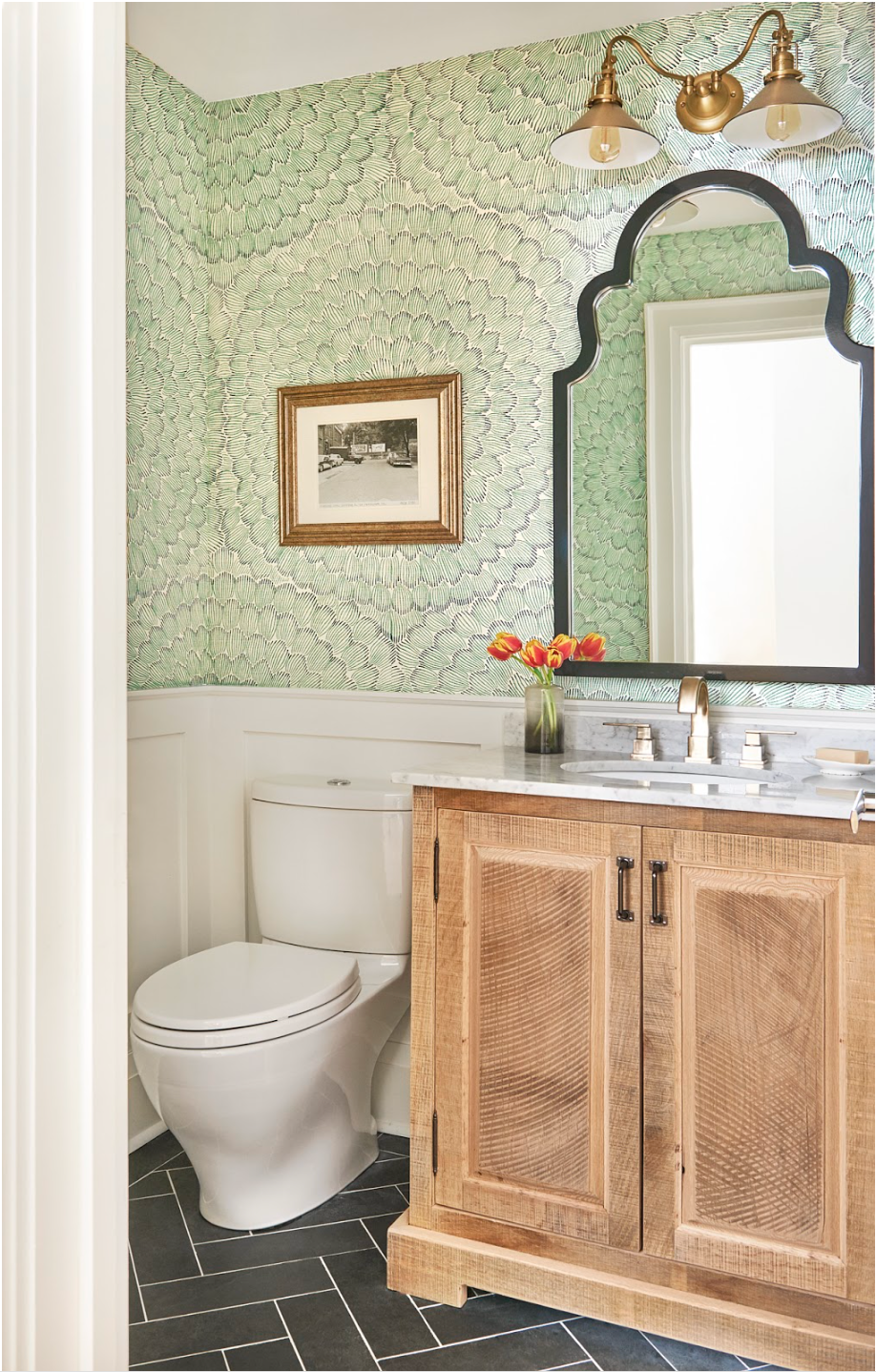
This wallpaper was our starting point. I fell in love with the grasscloth texture and emerald green pop of colour. The wainscotting was added to help keep the colour in check so that it wasn't too overwhelming (or expensive!). The warm wood vanity and gold accents are balanced by the dark floors and mirror. I love CONTRAST and we found the perfect balance here/
For the floor we opted for a simple dark slate tile and laid it in a herringbone pattern to add some interest. Accents of gold add sparkle and sophistication.
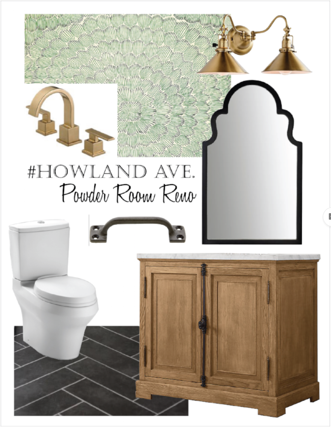
PLANNING: Once a plan is set in place, we create a mood board with all sourced items so the client can understand our overall design vision. This is helpful for those who cannot always visualize the space prior to demo!
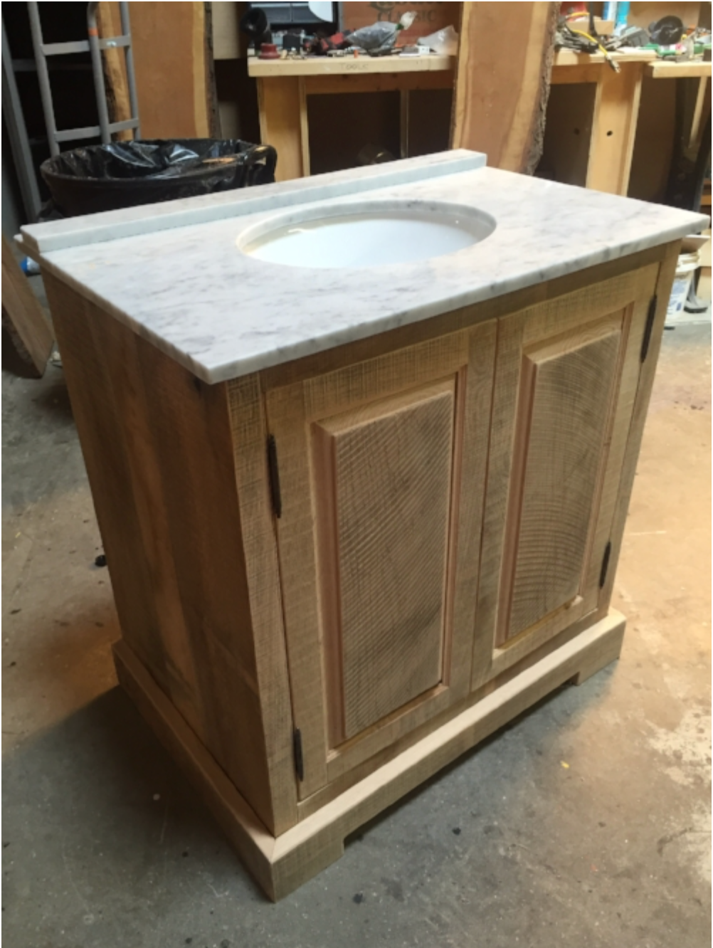
We designed the custom vanity to look old, and in a farmhouse style.
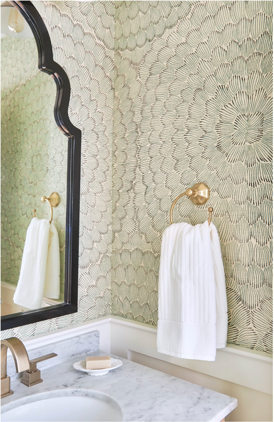
The Powder Room is now a brilliant space which functions more efficiently for this growing family. The herringbone slate floors add interest, while the wallpaper provided some much-needed personality. My client says it is now her favourite room in the house. She loves the wallpaper the most but overall how sophisticated and purposeful the room feels while still feeling warm and homey.
Tell us, what was your favourite element in this space? Were you surprised by the transformation? Comment below & let us know your thoughts!
Rebecca Hay Designs has a diverse portfolio ranging from luxurious private residences to large scale commercial projects. With a focus on quality and craftsmanship, Rebecca and her team design beautiful, functional spaces creating a signature blend of traditional and contemporary design. Visit their website to view more projects or read additional blogs by RHD.
) Author:Rebecca Hay
Author:Rebecca Hay| Tags:Renovation TipsGuest WritersRebecca Hay Designs |
Post comment


)
)
)


